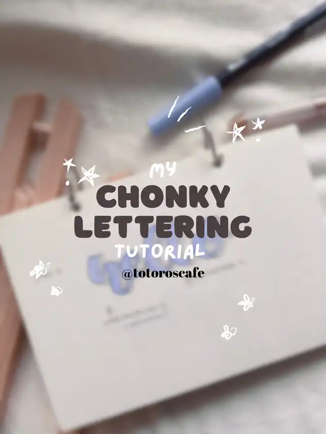
Ive gotten a few requests previously on instagram to do a tutorial on my chonky handlettering, so i thought it would be a great time to share it:-)
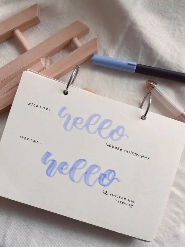
🧸 step one,
do the base calligraphy! if you’re not stable doing calligraphy yet you may download this printable sheets to practice:-) —> free printables:) this step doesnt have to be perfect or smooth as we’re going to refine it later on:)
🧸step two,
make the lines of the calligraphy thicker, this can be achieved by going over the lettering again but move it more to one side ! this will in a way “bold” the lettering and make it stand out! it is especially great for writing titles, etc
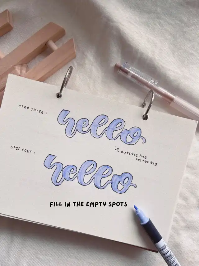
🧸step three,
outline your lettering with a black pen! do make sure your lettering has dried to avoid smudges🌱. the outline makes the lettering POP and stand out:-) of course if you do not want to outline its perfectly fine.
tip: if you’re using a dark coloured marker, you can outline it with a white pen instead!
🧸step four,
since the outline may be a little off, feel free to fill in the white spots with the thinner end of the marker so it has a neater look! If you’re going for a messy look feel free to skip this step:)
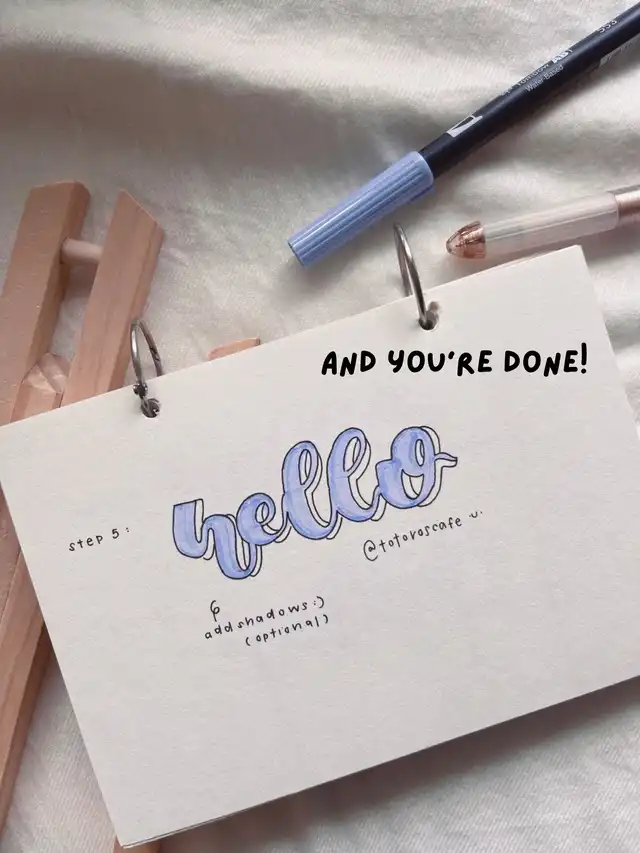
🧸step five,
lastly, you can use a black pen to give your lettering a shadow effect. this really makes the lettering POP OUT and look better! this step is optional but i love doing this as it also adds to the chonky-ness of the lettering !
tip: when doing the shadows, make sure to only add it to one side to make it more realistic. for example, i add the shadows on the right side of the lettering!
I hope this has been helpful if you’re learning how to do hand lettering! i also really recommend the tombow dual brush pen for the lettering as it has a larger tip and comes in a variety of colours. The other end has a fine tip which is great for filling in the spots! You can find it in almost any stationery store or you can shop it here! . Do let me know how it goes for you if you decide to give this a try!