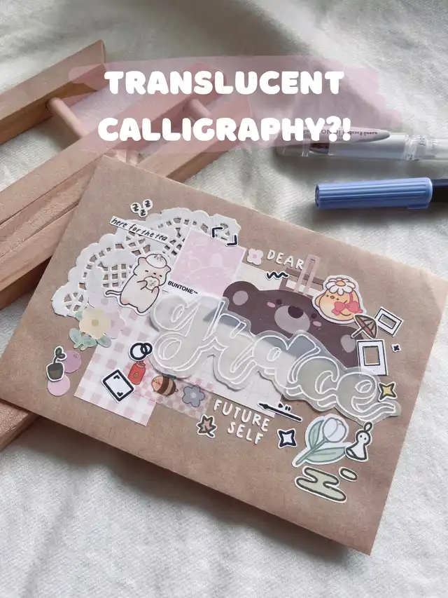
i personally love using this little hack as it is simple yet it adds such a nice touch to letters/titles etc! I also got a few questions about my translucent calligraphy so i thought i should just share it here!🤍
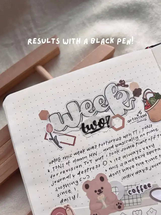
swipe to see another example but in black 🙂 using a black pen will really make the title pop on light coloured surfaces!
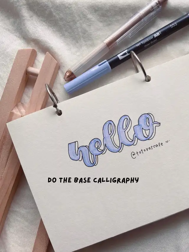
🌱step one
do the base calligraphy (check out my previous post for a tutorial if needed!)
I personally recommend using a tombow dual brush pen as it is very sturdy!
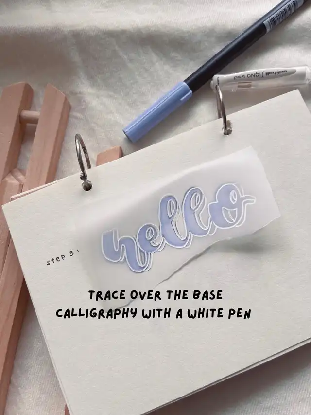
🌱step two
grab some tracing paper, i got mine from popular in 92gsm but alternatively you can get it here too! simply trace the base calligraphy with a white / black pen depending on the background colour:)
my personal favourite white pen is the Uniball BROAD 1.0 white pen! its the smoothest white pen ever and it’s literally so pigmented 🤩 im on my 2nd white pen already!
and thats it! this hack just takes you 1-2 minutes more from regular calligraphy and it looks amazing! i would really recommend you to try this out if you haven’t already:-) trust me, you’ll love it😆